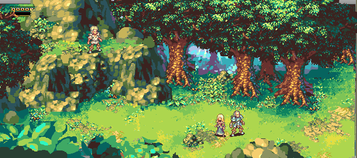
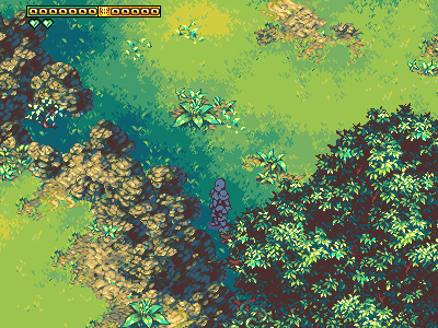
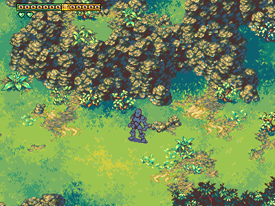
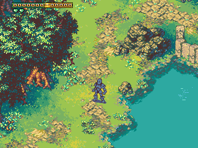
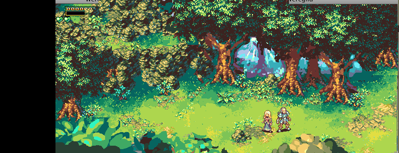
Very overgrown road.
RPG graphics thread
Jetrel
#22
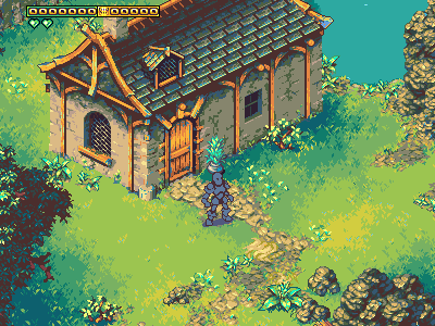
Regarding the list for the immediate release, we’ve got:
- finish off flagstones/walking paths
- finish off stone fences
- add light-streams to windows (no fancy orange glow yet)
- add several new miscellaneous interior bits of decor (plates, books, cutlery, you name it).
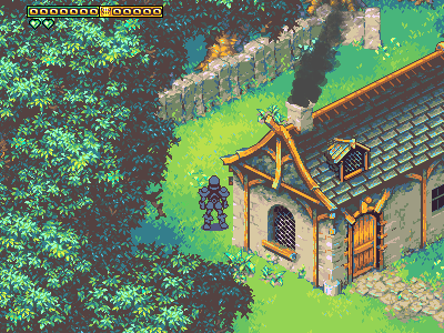
Fences are in. I’m brought to thinking they could probably use some really crumbled variants, and gates, but that’s something to pin on the far horizon. Having these for this release wasn’t anything crucial; the purpose was gradually chiseling away at the eventual need for proper town stuff. If I don’t hack into that now, it’d be quite daunting later.
So now I just need to magic up that interior decor, and we’re ready to make release numero 2.
Jetrel
#23
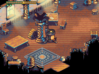
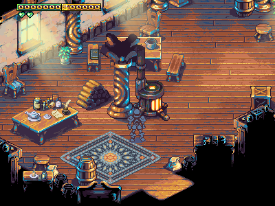
:-\ This was a lot of work, but the current house didn’t feel sufficiently full without it (the rug was a big deal; I think houses would generally look a little whack without rugs of any kind).
So, next, I need to implement all of these, and then do that solidity+zorder keying thing, and pack up the release. Tomorrow probably?
Jetrel
#24
Showing off a ton of decor (bottles and dishes and clutter placed on top of furniture) that I drew yesterday. Also in this shot is a bizarre omission that kinda slipped through the cracks (horrible pun, I know) - our floorboards didn’t terminate, which didn’t quite look right. Not sure how I overlooked that, but it’s fixed now.
EELuminatus
#25
Thanks for the release… finally had the chance to see those graphics in game.  (From SVN on SuSe, in case that matters.)
Lovely as they are, there are two issues that you might not have noticed:
- zorder is in some cases apparently messed up even more than in the screenshots above (e.g. the logs are “in front of” the pillar);
- the lightbeams’ flicker seems a little fast to me - does not fit well with the cosy atmosphere inside, so maybe it could be softenend.
Except for that, the interior is truly enjoyable!
Jetrel
#26
You need to update your subversion and recompile; the fix for this took place within the last 24hrs (r5005, I believe). Without this, you’d be getting exactly the results you described above.
Nevertheless, thanks for keeping me in the loop. The lightbeam thing is valid; I just gave it a QADH* that changes the alpha to a random value every 5 ticks; something better might be to follow some sort of sine-based loop, but the interpolation on that’s complicated enough that I don’t want to mess with it atm.
Thanks. 
There’ll be more to them, down the road (second stories and stairs come to mind), but at the moment, I’m postponing nearly all work on art to bootstrap the core combat logic, and turn this from a pretty tech demo, into an actual honest-to-god game.
*quick and dirty hack
EELuminatus
#27
Oh, I did update… just forgot to compile. :-[
Most of it is fine, really, only some minor glitches remain when walking close (horizontally) to some of the bigger objects, e.g. shelves, tables, boxes - just a matter of expanding their bulkiness a little, collision-wise. Maybe that’s the kind of job at which a grunt (like me) could lend a hand?
Jetrel
#28
NP. Been there plenty of times myself.
1] your help would be welcome. Keep in mind the license model on this is like frogatto rather than wesnoth, though I expect only the hardest-core gnuvangelists would care.
2] the collision-wise stuff, I fear, is going to be a compromise between “minor visual oddity when the player walks through it” versus "such wide collision rects that the player is seemingly obstructed by air. In fact I think this would still be an issue even in 3d, because having reasonable models (like the logpile where a log juts out at the bottom) would require the player’s model to “pass through” it unless we had the entire floor area of the logpile obstruct you. (That, or engage in rather perverse featurism where the player’s foot actually steps up onto the log.)
Frankly, I’m keen on being fairly permissive about collision, and having most “less than knee-high” stuff (except, currently, the stool, although I’m potentially reconsidering that) be entirely pass-through. The idea is to do differently from many games, and rather than “naively” map solidity according to “floor coverage”, map it according to what a real human can semi-comfortably step around.
There’s a pretty common and annoying rpg clich? out there where absolutely any ground extrusion, even a wildflower, or 30cm tall stone, will block the player. I find that kind of annoying, and I don’t think it’s too hard to make most blocking terrain look fairly reasonable. The rule of thumb is that blocking terrain needs to either be “about waist high”, or be the two special cases of either being “implied forest undergrowth” or “water”. The real key, though, is to make all cases of blocking terrain look like they’re not worth crossing. If you’re gonna block something that’s interesting and “desirable to get to on the other side”, then use no-nonsense heavy blocking terrain to block it off. Right now, our interior benches are solid, and it’s no problem because they’re right next to a table, or sitting out in the open. But if I set up some cafe where they were blocking an “aisle” down the middle of the room, that’d feel unfair.
DDR
#29
I guess it’d be fairly simple to whip up a bunch of solidity images, instead of using rects. Simple, but a bit of a time sink. (Though, this might only be needed for some of the more determinedly diamond-shaped objects… I don’t know.)
Jetrel
#30
I did a major re-evaluation of the palette; I think these new colors work much more nicely. The heart of it was darkening the “base color”; in this case, our basic grass tiles, by almost 10L; I think that gives a lot more flexibility in terms of a working gamut. Not only that, but this new set is a little warmer and earthier, and a little less pastel/neon.
The big problem with the previous grass was that it looked kinda neat in small snippets, but any wide expanse was a little unpleasant.
Jetrel
#32
I haven’t done anything since my last post, since I’ve been more or less full-timing on frogatto. I also wanted to stop and think about the direction here, since some stuff was bugging me that was hard to put my finger on, and the engine would grow to better serve my needs (as it has, dramatically). My biggest goal with weregild is to break the bad graphical genre conventions of 16-bit rpgs; the kind of things I can grow a callous around, but never really liked in the first place. Many of them are bad holdovers from early hardware limitations, like requiring everything to be tiled. Examples include: static foliage, scenery that’s always directly facing the player, SD sprites, cardinal-oriented base animations, etc.
But there are some that remain to be removed, and I think one of the biggest ones is how “flat” everything feels. Everything’s on a single parallax layer, and nothing has any 3d depth to it. Most damning is either the lack of any cinematic changes in camera positioning, or the fact that the primary one isn’t very compelling. Fortunately, we now have a lot more support for parallax, so I’m considering slightly redoing the camera angle. Slight enough that I should be able to use most of the current tile art and such.
If I do things right, every environment - even “nominally” flat areas, will be able to have parallax foregrounds and backgrounds. I’d love to go all-out and implement perspective-projection of different game-planes, like diablo 2 had, but that’s not currently on the table (I think I could probably pull a crazy-stunt to do that to objects, but I can’t do it to tiles).
Those following the project are well aware I’m borrowing lots of ideas from the snes classic SD3; this too is another one they managed to touch on, but it seems like one they only got to dip their toes in. It was something they tried for (what seems to be) an environment they added really late in the dev cycle, which used some new techniques they didn’t use anywhere else. I think they probably wished they could have redone the rest of the game like this, and I’d like to do what they didn’t have the opportunity to. (Namely, I’m speaking of how the “Forest of Wonder” quite nearly seemed like something that belonged to a sequel, rather than the same game that “Rabite Forest” was in - along with the several other areas using the same template.) Then again, Diablo 2 beat them by a country mile in this regard, having basically done this in every single environment.
Jetrel
#34
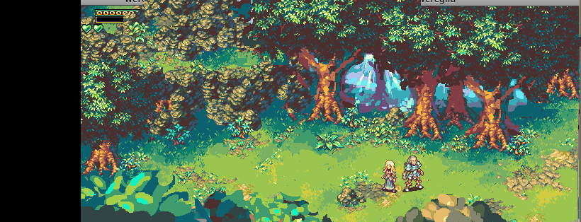
First and foremost, quick, dirty photoshop mangle/hack copypasta mockup to see what parallax FG/BG stuff would do. I think it’s a pretty solid “go”.
Second, was playing with a potential further finessing with the palette. (the one with 5 in the name is the new one; more contrast, bolder main green on the grass). I kinda miss how blue the shadows were before; I want to work that back in.
Jetrel
#37
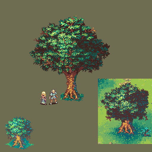
As per the above mockup, I need to make the trees bigger. Mostly in that the “stubby trunks” need to go away - the trunks have to be long enough that we can see a parallax background through them. This is a good excuse for me to do “take 2” on the trees, though; it features a slightly bigger trunk, but the more important feature relates to new engine stuff.
In the previous version, we had a single image of a leafless tree (trunk and branches), and on top of it, we had about 7 “leafy clusters”, with twigs but no branches. The trunk stood perfectly still, and the branches, to imitate swaying, would slide back and forth, occasionally having a big slide for a gust of wind.
Problems were that this “sliding” isn’t right - the branches really need to “rotate around” the spot where they’re attached to the tree, and also bend slightly. We couldn’t do that before, now we can, thanks to a great new engine feature dave wrote (which I have to do some complicated scripting to use, but still - awesome to have). To do this, though, I have to point out to the game where the attachment point is for each branch, which leads into a second major issue with the old ones - the complete lack of “branches visibly jutting through the foliage”, which looked unnatural. So now we’re gonna have underlying branches going through each clump of leaves, coming back to an “attachment” to a thicker part of the tree.
The bonus then is - the big boughs of the tree, underneath these leaves, will be picked from random sets, and connected together like legos. Why this matters, is now it’s safe to have gaps (another huge thing I wanted), which would result from randomly piecing these together. Which we don’t currently do - they’re currently all evenly spaced, and the motion is really brittle (they all have to unnaturally move in perfect sync), or they separate and the empty gap behind them makes it clear they’re just free-floating chunks. One thing that’ll be necessary will be darker chunks of leaves - the rear side of the tree, opposite the direction we’re currently looking from, which usually will be what’s revealed by branches parting. Relatively though these should be easy.
So this is drawing most of “one tree’s worth” of components; not entirely rendered, but I wanted to share where I’m at thus far. The big ugly hill to get over will now be writing the code that drives this; once that’s done, it’s all a downhill march. Drawing boughs and backside leaf clusters should be easy.
Jetrel
#39
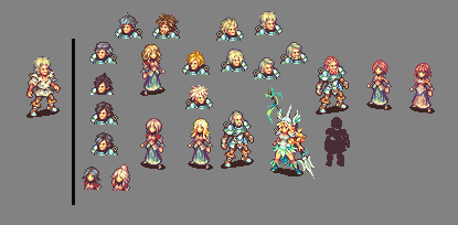
Some head/body design work. Mostly heads. I’m hoping to do a light amount of modularity in weregild; at the least enough to get variable head<->body combos going. More than that gets complicated, but who knows?
Also rendered what Lise from SD3 might look like in the style because I was having a rough time mustering motivation to draw one night. Fanart helps when grim determination loses its edge.
Jetrel
#40
Basically the same shit as before, except I’ve done a big sketch job trying out how “big rocks” look. I also dropped in the (mostly) rendered new tree.
Emphasis on sketch. I need to keep practicing this stuff with rendering large rocks and such; it’s so useful.