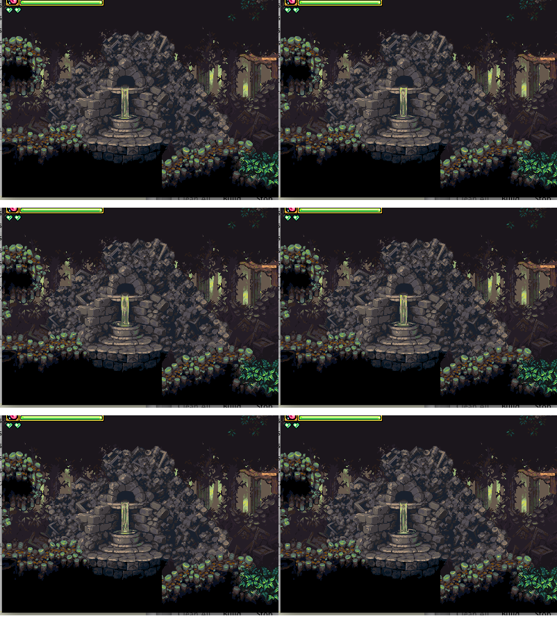
I am kinda back and forth between the examples. The overall shape and contour of the passage is better outlined in the new example, which I like.
Jet's terrain thread
:shrugs: Yeah, I really don’t think that’s a valid concern. There are a number of things people complain about when looking at a mockup or screenshot that really don’t hold water when playing an actual game. It really boils down to the game’s punishment mechanics - and I think a lot of people’s sentiments on this matter may be holdovers from “nintendo hard” games they played as a kid. If you misjudge this sort of thing in GnG or Castlevania - not on an emulator, but on an actual console, with no saving, you’re legitimately in deep shit. Limited lives, no saving, and any mistake can cripple your chances of getting past those later, nigh-impossible levels. It feels unfair because a certain graphic may have looked like you could stand on it.
But I’ve noticed in modern games, where there aren’t brutal consequences for misjudging this kind of thing - it entirely ceases to be a problem. Freedom to experiment means you can just take a swing at it and see. It’s only dangerous to experiment if you’d be forced to replay the whole game or something, and frogatto goes so far as to barely make people replay anything. I really think this is a misapplication of standards that only make sense in brutally-difficult settings with no margin for error.
For example: I’ve recently been playing through Shantae: Risky’s Revenge, and there are some tiles that literally are solid on some screens, and the exact same graphical tiles have completely different solidity on some other screens. Conventional wisdom would say that’s a horrible problem, but in playing the game it actually was mildly helpful (said tiles were turned into mere decorations on miniature levels/screens/rooms which had a nothing but a save-spot in them, which helped because you couldn’t down-jump through them, and they might otherwise make it slightly awkward to get to the save-point). (btw, strongly, strongly recommend the game - it’s just $3 on iOS, but it’s a full-blown, old-fashioned nintendo-style game, and has absolutely ace production values).
Anyways, the business of me removing the upper-outline of tiles actually isn’t just a style point - it’s necessary for a trick I’m going to occasionally use to increase the “depth” of the walkable ground in certain cases. By not having outlines, I can place objects with more of a given texture next to each other (in this case, objects that look like hunks of ground material), and they’ll seamlessly blend into each other. It’s the same trick I use to do the rocks in the rpg.
FWIW I prefer the “old”, higher contrast version in the switch gif, though I guess this sort of thing is very subjective.
actually, i’m not sure I agree with what I just wrote. Maybe the high contrast version is too strong given it’s just scenery. ignore me…
Having terrain non-outlined, and having active stuff outlined, is one thing I’m moving towards to more fully differentiate terrain and active objects.
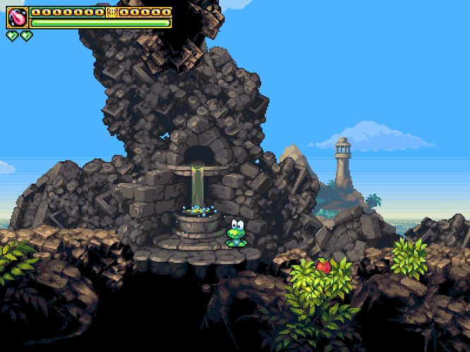
Replacing our tiny, “doesn’t mesh with the tiles … or anything, really” fountains with something huge that does.
Not happy with the dark area under the bottom, pleased-as-punch with everything else.
I don’t have a problem with the dark space below the fountain. It looks a little mysterious. If that doesn’t work, could always put a separate fountain beneath somehow…
For our resident guy with “a waterfall fetish”. :-*
(ignore the oddly chopped ground - just some garbage from working in photoshop)

You have NO idea how long I’ve been bugging Jet about waterfalls. We need a “Jetrel deserves a medal for putting up with a lot of crap and getting er done” emoticon.
Well, we’re in luck, because I happen to also really love “wicked-good” liquid animations in games - partly out of frustration from how bad they were in most SNES games. That was because they just couldn’t; the hardware just couldn’t do full-screen tile animations. Their best option for faking it was palette cycling, and that’s just sooo damn hard to do well. So the animations they had were often really … basic, and really low-frame count and jerky, even in the best games (sd3). The few smooth ones were really constrained and simple (zelda).
A lot of them did what I did wrong (IMO) on the current waterfall, and what I did right on this - they’d make a really noisy, wiry-textured stream of water. Rather than a smooth stream, with flat-ish speculars. I really like how this one came out, and hopefully I can backport the best aspects of it to the big waterfall without having to redo its logic. It’ll be hard, and is a task for a somewhat distant point in the future.
In the meantime, this has helped light the way.
But yeah - I want it as bad as rain; I just want a bunch of other stuff too. It’s also really hard.
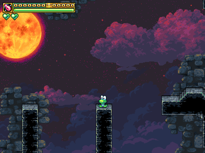
 I won’t lie - although I’m not ripping anything off from castlevania, our dungeon, stylistically, is pretty much a giant love-letter to it. (The only similarity is the basic idea: that the setting is of a dark castle, in the night sky, with a giant orange moon. None of the actual rendering or anything has been copied.)
[quote=“Joo, post:13, topic:94”][quote author=crimson_penguin link=topic=74.msg410#msg410 date=1284311677]
Multiplayer is a maybe-future feature (it was already worked on, and sort of worked, but was scrapped for 1.0).
[/quote]
Wow, would it be possible to sort of test it then? :D[/quote]
that would be really awesome. Assuming I can get my graphics card to work or scrap it all together and get a new one. mp? so like hot potato with ants? Lol. If you miss it will hit ya and do damage. X3


