Jet's terrain thread


#61

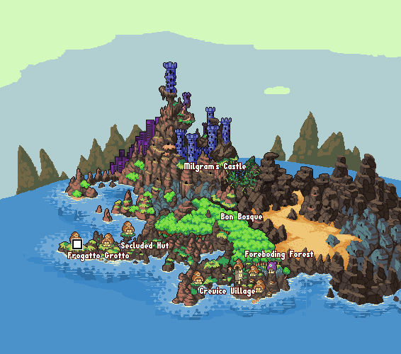
Jesus hotdoggin christ our current map is ugly.

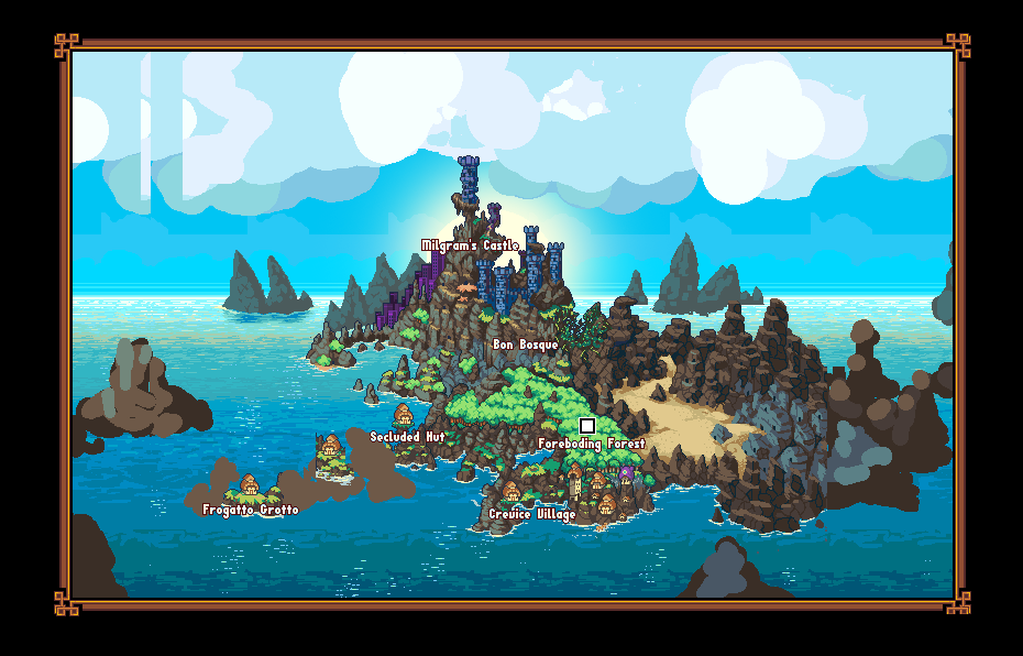
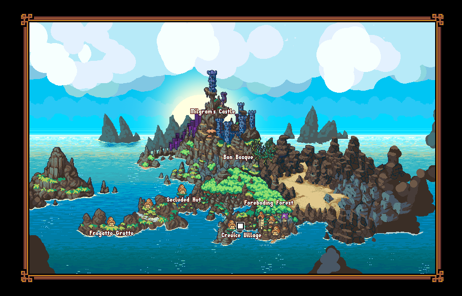
I’ve got a replacement that’s as done as you see in the attached pic. Of note; some of those whitecaps are animated as a particle system, and the clouds and water are moving parallax layers. The “frame” surrounds the map in-game, and allows the camera to move freely (e.g. not bumping into level-edges defined by where the art stops). If I had to actually draw enough art so the camera would never hit a wall… that would just be insane. As it is, this scale of pixelart is just gob-smackingly ridiculous.

I’m tempted to engage in scope creep to get this into the next release, since the current map really truly is one of the only embarrassing things in the game (at least, that’s actually in live usage), anymore. I figure I could get all the sketched parts of this (water, clouds, those few rock sections) done in about 20 hours.

Eventually, I’m tempted to gut the actual landmass itself, and draw something better in it’s same shape, but that’s a task for the far future.


#62

Wow, that’s a big improvement! The cooler, less saturated palettes and the water in particular. And I’m glad you decided to nix the spherical perspective, I like the new more realistic perspective much better.


#63

Artistic dude hit the nail on the head. My sentiments exactly. :open_mouth:


#64

Yeah, a big reason for nixing the spherical perspective wasn’t so much that it was “unworkable” as that it was un-“tileable”. The water you see in this pic is just a 128px wide strip, repeated - which isn’t so obvious since the vast majority of it is hidden under the land. With a sphere, I’d have had to draw the whole thing from scratch (7 times as much work?), and I’d miss out on another fun trick that brings the water to life - the tiled strips drift from left to right (a lot like the seaside background in the actual game.

The spherical perspective could have been made to work, but it would have been an enormous effort, for dubious gain. This also makes the island feel like a much smaller part of a much bigger world - as though there is much more stuff out there to explore.


#65

Did a bunch of additional rendering. The clouds obviously aren’t done, and there are a few other elements that could use additional rendering, but the whole of it at least is no longer “offensive to the eye”.

It’s now good enough that we’ve gone ahead and replaced the previous version with it.


#66

So much better, Jetrel. :smiley:


#67

We dunno, fine sand does not seem like they fit at this time; it is as well vibrant, different along with marked night below this. Perhaps mixing this along with the actual pitch-dark tone from the regular cubic-earth colour might assist? The actual fine sand moves, and appear mounted on something particularly due to the tone distinction.


#68

Yeah, I’m probably gonna give the sand a once-over before using it. I think I’ll add some receding into the foreground, and maybe make it less bright.


#69

sand color looks fine.


#70

So much work. :’(

Been making new forest-house parts, and polishing up the ones I’d worked on before. At least, they’re coming out (IMO) really, really nicely.


#71

YES.


#72

What he said. :smiley:


#73

Is that a guitar lying against the tree in the first example? Love those details. Nice variation between all the houses btw. A huge improvement


#74

Yeah, it’s a string instrument of some kind, maybe a lute or something, but it’s definitely open to interpretation, since I’ve yet to meet a string instrument I didn’t like. :stuck_out_tongue:


#75

heh. I like its subtlety. I notice the contour of the walkway differs in each example. I like this.
Also some floorplans for the tree houses are straight and others dip and bend abit. I wonder
… How will this impact the trajectory of frogattos movement over it, I wonder? Will he simply walk in a straight line across all the tree house paths ergardless of the differing designs , or will he walk in a way that follows the contour of the floor design??? Do you know what I mean?


#76

Yeah, I’m gonna need some better platform support to do this, but at this point, I’m more or less wholly depending on dave being able to do that for me at some point, since they’ll be quite complicated.

But yeah - it’d be really cool to have arbitrary slopes, and to have frogatto follow them, as though he’s walking along the contour of certain things.


#77

A necessary and long-overdue cleanup on the forest ground tiles. A rough before/after shot:
This little upgrade went faster than some of the previous ones, but it’s still hoovered up at least three 6+ hour nights. Dry as f*** but the results are worth it.

The only other upgrade I want to do to our existing stuff is a better take on “holes in the canopy” in the background. Current take isn’t quite there, but I’ve gotten about halfways into a redo, and it looks promising thus far. That and those bits on the tree roots I never quite got around to rendering. ::slight_smile:

After that, it’s pretty smooth sailing with just adding new monsters (I’m up to about 2 or 3 new ones thus far). Then levels, then story, and tie off our little present.


#78

Oh yeah, dave and I also fixed all the bugs on the parallax objects being placeable in the editor. That stuff is GO. ;D


#79

Here’s a switch .gif:


#80

While the new version is undoubtably an improvement from an artistic standpoint, I rather liked the dark outlines and higher contrast on the earlier version, it helped define the tiles as being in the foreground by making them distinct from the lower-contrast background. Now I feel like the tiles get lost in the background a bit.