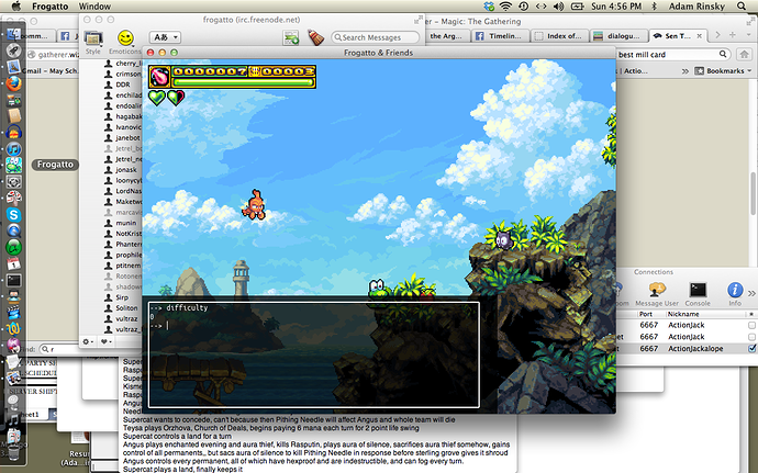
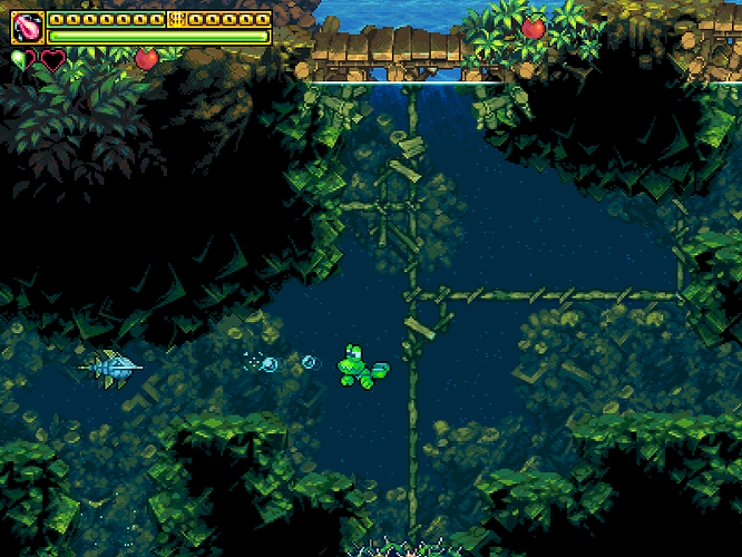
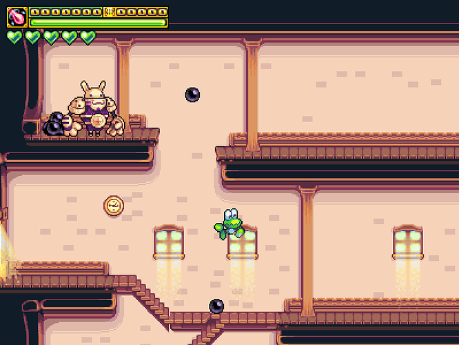
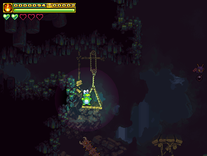
So, I was just looking at the screenshots we have up on the website and I think they could use some modification.
The shots we’re showing currently do a wonderful job of showing off our beautiful and diverse environments, but they lack a sense of the action we’re offering. Mainly, Frogatto is just standing still in the middle of the screen in each of them.
Frogatto can run, jump, duck, swim, stick to walls, swallow enemies, and breathe fire. He moves fluidly when he talks to people, and he can be fat or skinny. If our promotional images don’t convey this variety, we’re selling ourselves short.
I can’t do all these screenshots because the transparencies are broken on my build and there’ll be brown squares in most screenshots I’d submit, but I can get us started. I’ll see what else I can come up with.


