Some Bugs in the iOS and PC Versions of Frogatto


#1

I recently downloaded Frogatto for iPhone/iPod, and enjoyed it a lot. There are a few bugs I’d like to point out, in case the developers aren’t already aware of them. I’m running Frogatto version 1.0.3 on a 3G iPod with iOS 4.0 installed, if that makes any difference. :slight_smile:

  1. (iOS only) When the ‘slabs’ (the two big blocky creatures) in Milgram’s fortress attack you, they simply hit you and die, and you don’t lose any life at all.

  2. (iOS only) I played with the A and B keys reversed. I noticed that when you have an object in your stomach and then fall into water with it and try and spit it out, the A key won’t respond unless you hit the area where the B key should be (or where the a key should be by default).

  3. (iOS and PC) This bug is present in both the iOS and PC version of the game. When Frogatto jumps in front of a window with light rays coming from it, the light rays are in front of Frogatto rather than behind him (see attached screenshot). I’m guessing this is because the light rays are on a higher layer level than the PC. I don’t suppose this was intentional?


#2

1] probably a bug

2] bug

3] intentional. The light is tiles, not an object, and can’t be smart about getting cut off. Making it an object might be feasible, eventually, but I’m not gonna dick with it atm. This is one of those minor cosmetic issues that would really be pathological to fix, because it would come at the cost of much, much more important things (these issues pop up like whack-a-moles in all game-development).

Part of this is not giving up the current level-creation-efficiency-bit in the editor. We could do this, right now, with an object; we could make an object the size of the window. However, this would mean that for every single window in the game, we’d have to place a “light stream” object on it. Right now, creating a window is a single operation, and as a general trend in designing the editing, we want all acts of creating something to be as close to one operation as we can get them (obviously, some things right now like creating a forest tree, are a bit of a bitch).

Right now, the window light automatically spawns itself when you place a window. In fact, windows aren’t a separate tool you have to grab (switching away from wall tiles) every time you want to place a window (and then requiring you to switch back to wall tiles to get back to placing those). To get a window, you simply cut a window-sized hole in the wall - suddenly, the window, and the light-stream, just appear. Now, unfortunately, we currently can only use this to place tiles.

I’ve had a hypothetical feature idea where certain MTPs trigger the creation of an object at a given tile position. I haven’t really thought this through, but the gist is simply that certain MTP patterns, if placed, would also add an element to a list of formulas to be evaluated when the level is created; which would each have access to an X,Y position based on where that MTP got placed. Based on these, certain tiles could automatically spawn objects. Graphical holes in a back-wall of stone could spawn lightstreams. Dragged sections of foliage - instead of or in addition to spawning foliage tiles, could instead spawn foliage objects at regular intervals, which could then be animated. (that said, a similar effect could be done with a generator; with bounds and spawned child objects, and would probably be simpler that way).

This is just my incomplete brainstorming on the subject. This may not be a good idea, for some reason I haven’t seen yet.

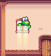
#3

Why can’t we just dither the top of the light beam, so it starts off a bit fuzzy?
(Alternatively, do tiles support transparency?)


#4

[quote=“DDR, post:3, topic:144”]Why can’t we just dither the top of the light beam, so it starts off a bit fuzzy?
(Alternatively, do tiles support transparency?)[/quote]

Stop and think about how that wouldn’t solve the problem in any way.
The problem isn’t that the transition on the light is sudden.

The problem is that there’s no way the light should shine through frogatto. That’s what looks whacked.


#5

Jetrel: It wouldn’t shine through frogatto, but the light coming in from above would shine through and down on to him, and maybe you’d get a bit of halo. I think the attached image doesn’t look half bad, being a cheap mock-up of the effect and all. Yes, it does look a little off, but what we have now looks way off. Dithering didn’t look any good, imo, so I just did a fade effect. :slight_smile:
An alternative would be to fade the whole light beam. That way, you get (mostly) the full effect at the bottom, and you don’t have the transition artifact at the top, AND you shouldn’t notice the ‘shine through’ effect as much as you do with the mockup.


#6

Makes sense. I’ve applied the fade-in, exactly as you suggested, and removed the alternate zorder for those top-two tiles. Now the whole light-stream is uniformly in front of frogatto.