RPG graphics thread


#1

I’m gonna save the other main thread for big release announcements and such. In this thread, I’ll dump various graphical stuff that’s work in progress, but is cool to see.

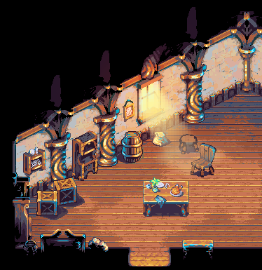
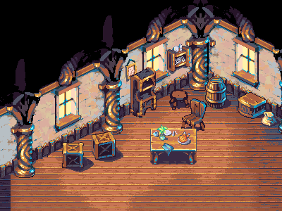
Amongst my other duties (frogatto 1.1 being the big one), I’ve spent the last few weeks getting some interior graphics going on. As an aside, I’m finding as I get more experienced with pixelling; it’s not the act of drawing, but it’s instead working out textures and colors that’s the harder part of the job. I banged up a draft of this in just a day or two, but polishing it into something professional-looking took another week and a half or so of work.

As I post this, I’ve gotten the majority of the work done on the floorboard tiles, and they’re now in-game and useable. Walls will be done as individual objects placed at regular intervals (a bit like cliffs), and should be trivial to implement, but a moderate amount of work to do the additional variants (ones with doors, ones without windows, etc. I also still have some polishing to do to the pixelling on the walls. Furniture is in various states of completion (that stool, for example, is barely a sketch).

I’m gonna keep slicing away at this over the next week. If I feel like it, I might kick out an update of the “pre-alpha” with enlarged (~25% bigger, to match the player) buildings, working building doors, and interior graphics.

Side note: don’t get the dumb idea this game is “iso” in the sense that videogamers usually take the term; Yes, the perspective is isometrically shortened. Yes, I’m angling some buildings and walls because it makes stuff look better when it’s not seen as an absolutely dead-on angle. But no, I’m not limiting myself to angled scenes in the way some inflexibly-engined “iso” games do. There will be a healthy mixture of vertical and horizontal walls in use; I just haven’t drawn them yet.


#2

SEXY.


#3

as always … awesome work Jetrel! :wink:


#4

Yeah, this is impressive.


#5

Mmmh… chicken! :stuck_out_tongue:


#6

Did I mention… SEXY???

The illumination on the items in the room via light source really provide a really nice ambiance. Makes me feel like I’m in a warm cozy tavern or something.


#7

The only thing I can think of that would really make this room come to life even more than it already is would be streaming light through the windows… which I’m sure you’re already well aware of. :slight_smile:


#8

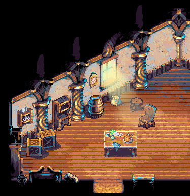
Yeah. I don’t know if the following will be possible with OpenGL blending modes for our entire audience (meaningless if it’s something only a scant collection of machines support), but this is a shot of what light streams could potentially look like.

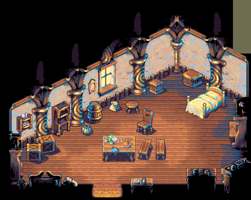
Also showing off a bunch of additional furniture. I need to make maybe a dozen more pieces of furniture, and I also need several additional wall sections to make the walls flexible enough for real usage.


#9

Looks pretty cool. Too bad if it doesn’t work on all versions


#10

Huh - apparently I didn’t use blend modes on the stream itself, so that much is guaranteed to work. What’s in the attached picture will work on everyone’s machine. The missing part would be that sweet-looking “warm glow”.


#11

You know what’s weird… It’s a fairly subtle difference between examples in terms of opacity of the sunlight and overall intensity of color, but the room in the first instance does look quite a bit more warm, illuminated for some reason… Weird. Are my eyes playing tricks on me? lol.

Also , would the beams of sunlight flicker in intensity as they came through the window? If so, maybe we could find out a variable for plugging in a pulsing effect so that the light source slowly lights up and dims as can be found in square snes rpgs of the time…

Top notch stuff, Richard!


#12

Nope, your eyes are NOT playing tricks on you - they’re seeing exactly the thing I turned off. A big ball of warm orange glow/tinting not just on the lightstream, but on everything right around the window.

That should be pretty trivial to do in frogatto’s engine. 8)


#13

Sick!


#14

A bunch more furniture, especially silhouetted stuff to establish the level bounds. Ignore the seam on the floor, that’s just mockup cruft. Also, I think I might need to make that table taller.

I’m starting to get a bit burned out on this specific task of drawing interiors/furniture, so I think I’ll push this next milestone really hard and get it done tomorrow, so it doesn’t drag out to a week from procrastination. I need to finish a few important pieces before I can consider this milestone done; specifically, I need to make:

  • a rug

  • a side-facing chair, and a south-facing chair.

  • a dresser with drawers
    - a bed (edit: got it halfways/kinda done)

  • a southeasterly wall and door (vis-a-vis, this mirrors to southwest)

  • a fireplace (might put this one off)

  • a northerly door (might put this one off)


#15

Dang, I didn’t finish anything in the previous post’s list yet.

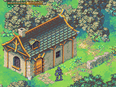
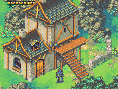
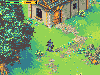
However, I did nail one big item that’d otherwise be hanging over my head: redoing the house (which predates our player-model) so it matches it in size. I also actually drew the door, now.

I’m also doing some of the first work on exterior man-made props, nearly all of which will be static, which keeps the workload light. You can see some walkway pavers which I’m not quite happy with (but aren’t fundamentally flawed, so it’s just a bit more work to finish them), and a stone fence I am happy with.

Stone fence only needs a few more variations, and we’ll have enough to handle most needs.

Ideas:

  • wells
  • raised wooden platforms, for porches and just general “out of the mud” communal use.
  • communal ‘slate’ chalk board with a small rain awning (equivalent of a modern communal bulletin-board like you see in a grocery)
  • standing signs
  • standing hanging oil lamps
  • all of the crates/goods ideas from AoE3 (there’s an ample variety, and I might be able to pitch-shift stuff from our interior environment)
  • shrines
  • statuary
  • birdbaths
  • splitting stumps, with axes
  • logpiles
  • haypiles
  • wagons

Plans, thoughts:
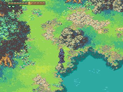
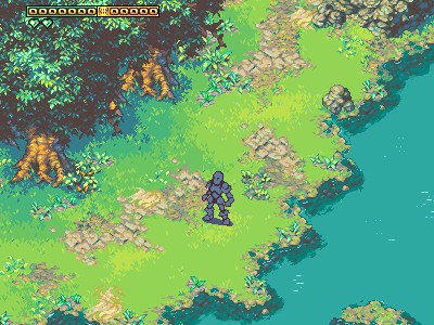
One of the longer-term plans is that there’s going to be a lot of commonality between tilesets. For example, there will be a desert environment, and its tiles will be completely compatible with these, and even our existing patches of sand (the same look). This will be useable in this environment, for wide patches of sand, but all the grass and such from this environment will port with a palette shift to working in a desert/badlands environment. This way, we’ll be able to share a lot of assets between tiles (snow, for example, will mostly be palette-shifted desert, like it was in SD3).

Different trees (boreal?), different architecture, and a palette shift, and all the same rocks and everything will make a major new environment (e.g. another country) without looking cheap. I’m tentatively planning to make another set or two of rocks, with precisely the same palette, but wildly different texturing. This again would be another major “mix and match” element to make different areas look the part.

I’m hoping I can actually treat all of our rocks and most of our ground/dirt texture, when combined with a palette shift, and a good “fade to black” tileset/objects, as a cave tileset, eliminating the need to specially make separate rocks for one (and even giving us a bonus of having a wide variety of cave tile types, whereas most games have only one).

The ultimate scope will probably add up to about 3-5 variations of each basic “thing” for the entire game. For a thought on similar games, it’d be similar to the requirements of SD3 and chrono trigger. Chrono trigger never felt reused/spread thin, across the entire game, which was a very good sign. SD3, alas, did reuse its tiles just a tad too much, but I think a mere one additional tileset of rocks would have fixed it - (this was compounded by how SD3 had the long 3rd act of traveling into the god-beast’s lairs and fighting them, it was an entire act of the game, and every single thing in it (monsters, tiles, everything) was a palette shift of existing content, with the exception of the forest of wonder. Without that act in the game, SD3 wouldn’t have “sinned” at reusage. By comparison - the fourth and final act; entering the final-boss’s lair and beating it, was sufficiently unique for all 3 player-pairs, having both unique/brand-new art for each environment, and having some (not quite enough, but maybe halfways there) unique monsters. Sword of mana did a much better job at this.


#16

The houses are assembled from parts, and the intent to this was to allow us to construct a variety of interesting houses and such for towns. To do that, though, I need a sizable number of additional parts. Here’s a start, showing some elevated ramps, and a second-story for houses.


#17

Looks pretty dope.


#18

Ummm if you can make it so people can walk under the ramps as well as on the ramps, I will be pretty impressed. :-p

I think just making it so people can walk on the ramps would be pretty hard.


#19

Regarding the list for the immediate release, we’ve got:
- finish off flagstones/walking paths
- finish off stone fences

  • add light-streams to windows (no fancy orange glow yet)
  • add several new miscellaneous interior bits of decor (plates, books, cutlery, you name it).

Point in bold is what I’m working on right now. I was gonna do these as standalone objects, but because we’re gonna need a lot of cobblestone roads in moderate-sized stretches, I opted to go the extra mile and make these into an actual tileset. This ate an extra day or two of time, but it’s a good thing to take care of now rather than later, and when this is done the last two items should fly by pretty fast.


#20

They’re “finished enough” for now. I’ll add any additional transitions as needed, as I’ve done with the dirt.

Onward we go.