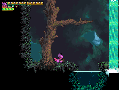
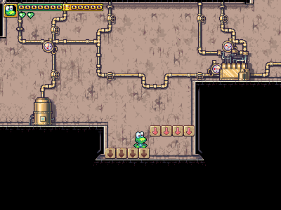
Jet's terrain thread


#1

Yes, it’s a dev forum. Yes, we welcome contributions to the core game from non-team-members, as long as you grant us copyright to the work.

Anyways… I’m using this thread to post really WIP (work in progress) stuff - too WIP to necessarily be posted on the main page for exposure to the wide, unruly world of people who seriously don’t “get” what WIP means (and who might, hypothetically, repost stuff on news sites and such as an official screenshot of the game).

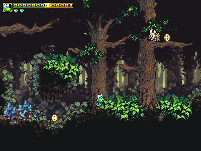
So first things first, here’s some upcoming forest-underbrush I’m working on. It’s non-interactive, like grass.

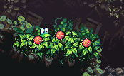
Also, here are some exploding (and spittable) melons that are a combination tool and trap. They’re harmless to get tongue-snagged and spat at an opponent, but they’ll explode if either you or an enemy bumps-them.

#2

Right now, the Forest is almost uniformedly cool colors and undersaturated colors. Next to the grayish-blue of the ground, the green undergrowth seems garish. Perhaps replace the yellowish colors with bluish colors, and decrease saturation a bit?

If such vegetation’s going to be added to the forest, they’d need to either be extremely rare and more in lockstep with the background style, or extremely pervasive and greater in variance as to trump the background and underlying platform tiles.

The melons sound like a cool idea and is a great new thing to add to an otherwise repetitive forest.


#3

It’s relevant to note that they’re the exact same palette as the canopy.

My initial kneejerk frustration aside, yeah, the man has a point. Turns out there’s a really nice solution, too. :slight_smile: We had another darker color, off the bottom of the palette, used on the canopy, so I moved the whole palette down one unit, and re-applied some of the brightest shade as speculars. I.e, I made each color on the image use the next lowest color in the palette of the previous version. This is one hell of a time-saver that’s unique to pixel-art.
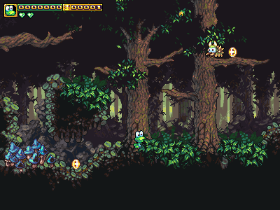
Thanks a bunch for pointing that out - I’m not usually proud of my own work, but I was taken enough with how well the shape and material rendering on these turned out that I didn’t do the best job of integrating them into the scene.


#4

Yeah, this is a huge deal we’re trying to fix. My current big project is pumping up forest content, hard. The forest currently feels (gameplay-wise) like a clone of world-1, and doesn’t have much unique stuff to recommend it (it also doesn’t have much story to it, yet, but that’s a separate deal). We’re trying to make more monsters, and more puzzle-elements.

Actually, we’d love it if you had any interest in helping provide ideas. Likewise, you’re welcome to try your hand at art for any of these ideas.


#5

wow. The change in color really makes a BIG difference! Love it


#6

Is the forest art in the downloadable version of the game? I’d like to try my hand at making a map :).


#7

We will release 1.0.2 very shortly (hopefully tonight), so waiting for that is the best idea.


#8

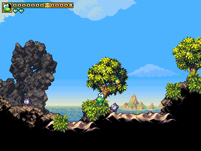
SAND!

For obvious reasons of physical behaviour in the real world, and of saving massive amounts of work, these tiles won’t have wall or ceiling pieces. Only slopes. They’re intended to always be paired with hard rock jutting out of them, like in this screenshot.

Hopefully, this’ll finally let us give some proper beaches in game, which has been a wacky omission, when you think about it.

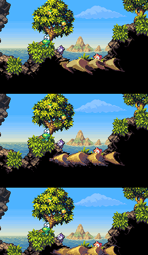
I’ve also attached an image that shows all the stumbling attempts I had to work through to get to this final result.

C&C is always welcome, of course. :slight_smile:


#9

I dunno, sand doesn’t look like it fits right now; it’s too bright, contrasting with stark darkness under it. Maybe blending it in with the darkest shade of the normal cubic-earth color would help? The sand hovers, and doesn’t seem attached to anything in particular because of its shade difference.

Also, if I may ask, why did you guys make the earth all cubic? It’s an awesome style and makes Frogatto much more original in graphics, but I can’t help but wonder how you guys came up with the idea of using complicated perspectivized cubechunks for the dirt.


#10

That much doesn’t bug me, but you’re free to post an edit to demonstrate your suggestion.

It really kinda happened by accident. Basically, it’s just capricious “art faggotry”, if you will. I decided to do something silly without any strong reasons for doing it; I simply felt it’d be cool. We are essentially a silly game/setting, so it doesn’t hurt us to do that.

The idea was basically that most videogames, especially in the good old days, were made out of boxes. So I drew a bunch of boxes - except not in the form you usually run into them. :wink:


#11

I was curious as to whether or not this will have Game Center support and you can have online 2 player co-op.

Obviously that last part may never happen, but hey if you can make another playable character we could be in business. :slight_smile:


#12

Multiplayer is a maybe-future feature (it was already worked on, and sort of worked, but was scrapped for 1.0). Game Center… Not sure, I think we’re gonna do OpenFeint, and it seems like it’s one or the other.


#13

Wow, would it be possible to sort of test it then? :smiley:


#14

You can have both Open Feint and Game Center. Game Center has free online servers apparently OF does not.


#15

Basically, multiplayer worked, but because of the whole way it was designed, it was very laggy. Dave has said he needs to completely overhaul it. The code is also probably very broken at this point, because the rest of the game changed around it.

For an analogy, it’d be like living in a house with a gas generator that you use whenever there are rolling-blackouts from the power plant, but which you haven’t used in the past couple years because those haven’t happened. During that time, you remodeled, and the thing isn’t even plugged into your house’s wiring anymore, and doesn’t have a fuel line.

Anyways, the more you clamor for multiplayer, the more likely dave will hunker-down for the deep-hacking session(s) required to make it. If you want it - please do make it known. I certainly want it. :smiley:


#16

I still am dissatisfied with how organic the trees are. Fortunately, I think it’s a reasonably easy fix; I just need to draw more, and draw a few “very large” segments. The biggest of the current trunk segments are a mere 2x2 tiles.

The attached is is what happens with a 3x4 and 2x4 chunk. Given that, I think it’s just a matter of drawing several of those, and a few more branch variants.

(ignore how it’s on a strange test level, that’s irrelevant)


#17

I guess it could be improved, but that looks really nice already!


#18

Looking forward to seeing how this turns out. Those large, horizontal branches are striking me as subtly off right now.
Looks nice. :slight_smile:


#19

A small atrocity of modern engineering: ::slight_smile:


#20

:smiley:

Now that’s nice!